
Crafting the Perfect Fashion Brand Sign: Avoid These Common Pitfalls
In the vibrant world of fashion, where first impressions are everything, your business sign is your brand’s silent ambassador. It’s not just about catching the eye; it’s about capturing the essence of your brand and leaving a lasting impression. Yet, even the most stylish brands can stumble into common design traps. Let’s delve into five frequent missteps in business sign design and discover how to sidestep them with flair.
The Art of Brand Consistency
Imagine walking into a fashion boutique expecting chic minimalism, only to be greeted by a sign that screams chaos. This disconnect is what happens when brand consistency is overlooked. Your sign should be a seamless extension of your brand’s identity, echoing its colors, fonts, and overall vibe. A cohesive look across all marketing materials not only reinforces your brand message but also builds trust with your audience. So, before you finalize that design, ask yourself: does this sign speak my brand’s language?
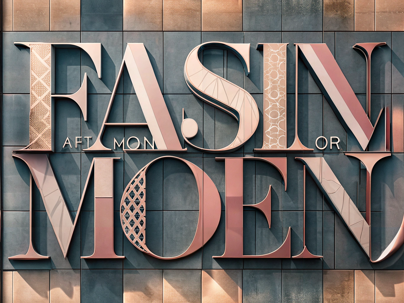
Readability: The Silent Communicator
In the fashion industry, where aesthetics reign supreme, it’s easy to get carried away with intricate fonts and subtle hues. However, if your sign isn’t readable, it’s not doing its job. Opt for bold, clear fonts and high-contrast color schemes that stand out, even from a distance. Consider the sign’s placement and lighting—especially in bustling areas—to ensure it catches the eye of every passerby. Remember, a sign that can’t be read is a conversation that never starts.
Knowing Your Audience: The Key to Connection
Your sign should be a mirror reflecting the desires and tastes of your target audience. Are you speaking to the young and trendy, or the sophisticated and luxurious? Each demographic has its own visual language. A modern, edgy design might captivate a youthful crowd, while elegance and sophistication might resonate with a more mature audience. Tailoring your sign to your audience’s preferences isn’t just smart—it’s essential for engagement.
Simplicity: The Ultimate Sophistication
In the quest to convey everything, many brands end up saying nothing. Overloading your sign with information can overwhelm and confuse. Instead, embrace simplicity. Focus on the essentials: your brand name, logo, and a succinct message. This minimalist approach not only enhances readability but also ensures your sign is memorable. After all, in the world of fashion, less is often more.
The Importance of Upkeep
A sign is not a set-it-and-forget-it affair. An outdated or damaged sign can tarnish your brand’s image, suggesting neglect. Regular maintenance and updates are crucial. Assess your signage for wear and tear, and ensure it reflects any changes in your branding or marketing strategy. Keeping your sign fresh and professional is a testament to your brand’s commitment to quality and attention to detail.
Elevate Your Brand with Thoughtful Signage
By steering clear of these common design pitfalls, your fashion brand can craft signage that not only stands out but also resonates with your audience. Prioritize brand consistency, readability, audience alignment, simplicity, and maintenance to create signs that are not just seen, but remembered. In the competitive fashion industry, let your signage be the statement piece that sets you apart.