
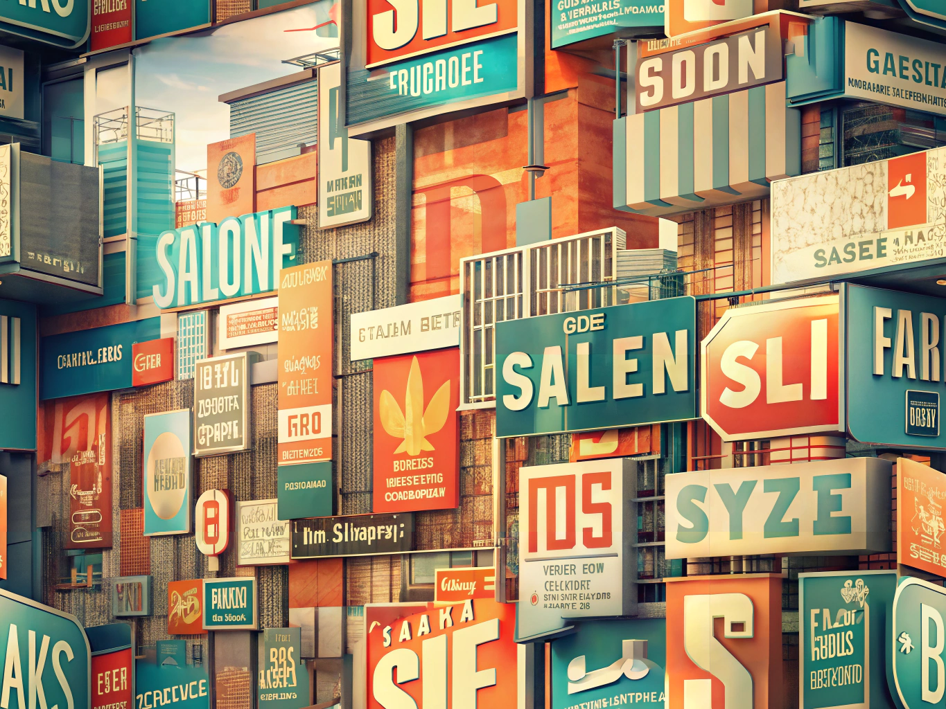
The Art of Signage: Crafting Messages with the Perfect Font
In the vibrant world of signage, the font you choose is more than just a design element—it’s the voice of your message. Whether you’re crafting outdoor signs that need to shout from a distance or business signs that whisper professionalism, readability is the key to success. Let’s dive into the six best fonts for signs that promise maximum visibility and legibility, ensuring your message is not just seen, but remembered.
The Power of Font in Signage
Imagine your sign as a canvas and the font as the brushstroke that brings it to life. The right font can transform a simple message into a powerful statement. For outdoor signs, clarity from afar is essential, while business signs demand a touch of sophistication and brand identity. The perfect font doesn’t just enhance readability; it amplifies your message, ensuring it resonates with your audience.
Helvetica: The Timeless Elegance
Step into the world of Helvetica, a font that has stood the test of time with its clean, modern allure. Known for its simple, sans-serif design, Helvetica is a favorite for sign visibility. Its uniformity and clarity make it a versatile choice for both outdoor and indoor signage, ensuring your message is effortlessly readable from any distance.
Futura: Boldly Modern
Enter Futura, a geometric sans-serif font that exudes modernity. With its bold lines and clear structure, Futura is one of the most legible fonts for signs. It’s particularly effective for business signs, where a contemporary and professional look is paramount. Futura doesn’t just communicate; it captivates.
Arial: The Reliable All-Rounder
Meet Arial, the versatile font that has become a staple in the world of signage. Its straightforward design and readability make it one of the best fonts for signs. Whether for outdoor or indoor use, Arial ensures your message is clear and easy to read, making it a go-to choice for many.
Verdana: Clarity in Design
Verdana was crafted with readability in mind, especially on screens, but its clarity extends to signage as well. With wide spacing and a large x-height, Verdana is one of the best fonts for sign visibility, particularly in digital displays. It’s a font that speaks with precision and clarity.
Impact: Making a Statement
True to its name, Impact is a bold, sans-serif font that demands attention. Perfect for signs that need to make a quick impression, its thick strokes and condensed letterforms are ideal for short, impactful messages on outdoor signs. Impact doesn’t just catch the eye; it holds it.
Times New Roman: The Classic Touch
For those who appreciate tradition, Times New Roman offers a serif font that conveys trust and reliability. While not as common for outdoor signage, it remains a popular choice for business signs where a classic and authoritative appearance is desired. Times New Roman is a nod to timeless elegance.
Crafting the Perfect Sign: Tips for Font Selection
- Contrast and Color: Ensure your font stands out against the background for enhanced readability.
- Size Matters: Adjust font size based on viewing distance to ensure clarity.
- Test Visibility: Always test your sign in its intended setting to ensure it shines under various lighting conditions.