
The Art of Signage Contrast: Transforming Your Printed Sign Design
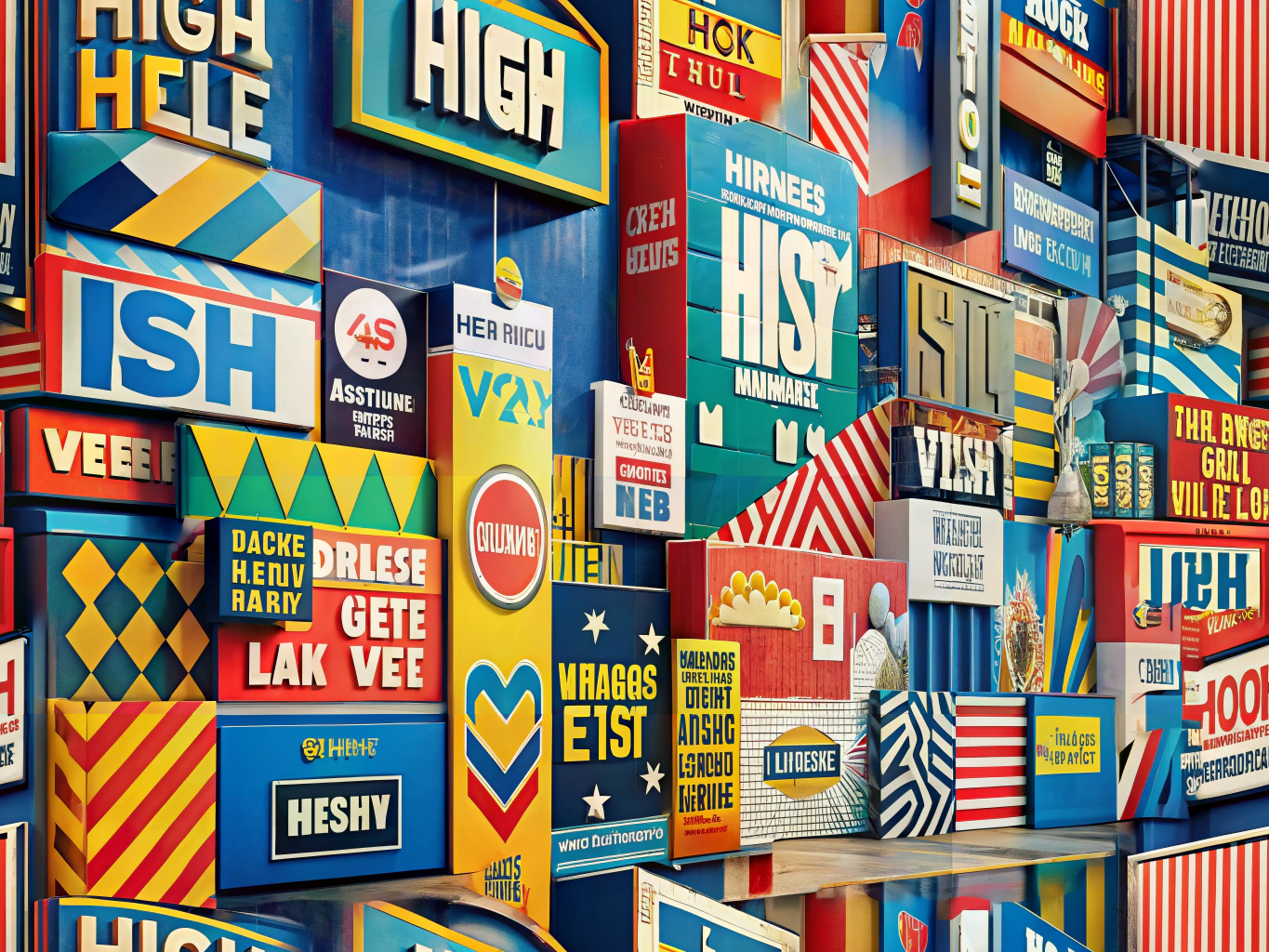
The Magic of Contrast in Signage
Imagine a world where every sign blends into the background, lost in a sea of sameness. Contrast is the hero that saves the day, making objects distinguishable and messages memorable. In the realm of printed signage, contrast is your secret weapon for grabbing attention and ensuring readability. By mastering the art of contrast, you can create high visibility signs that not only capture but also hold the viewer’s gaze.
Color Alchemy: Choosing the Perfect Palette
Selecting the best colors for signage is akin to choosing the right notes for a symphony. High contrast color combinations like black and white, yellow and black, or blue and white are the classics that never fail. These combinations ensure that your text and images leap off the page, commanding attention even from afar.
Crafting Contrast: Techniques to Transform Your Signage
- Color Contrast: Think of contrasting colors as the bold strokes of a painter’s brush. Pairing dark with light colors can make your text and graphics pop, creating a visual feast for the eyes.
- Font and Background Harmony: The dance between font color and background is crucial, especially for text-heavy signs. A sharp contrast ensures that your message is not just seen but also understood.
- Size and Scale Drama: Larger text and images naturally draw the eye. Use size contrast to spotlight key information, making it the star of your signage show.
- Texture and Material Magic: The texture and material of your signage can add another layer of contrast. Glossy finishes reflect light, enhancing contrast, while matte finishes reduce glare, improving readability.
Visibility Vignettes: Tips for Signage Success
- Location, Location, Location: The placement of your sign is as important as its design. Well-lit areas enhance visibility, with natural light acting as a spotlight for your message.
- Branding Brilliance: Consistency is key. Use a cohesive color scheme and font across all signage to reinforce brand recognition while maintaining high visibility.
- Trial and Triumph: Before unveiling your design, test it in its intended environment. Adjust colors and contrast to ensure your sign shines in its setting.
Designing for the Environment: Printed Sign Considerations
The environment is your canvas, and your sign must complement it. Outdoor signs face different challenges than indoor ones, with lighting conditions playing a pivotal role. Consider the viewing distance to determine the perfect size and contrast levels, ensuring your sign is both seen and understood.
Contrast in Advertising: A Symphony of Design
Contrast in advertising is more than just a color choice; it’s a strategic symphony of design elements. By weaving these signage contrast techniques into your creations, you can craft high visibility signs that communicate with clarity and allure. The goal is to make your sign not just visible, but unforgettable.
In the grand finale, using contrast effectively in printed signage is your ticket to enhanced visibility and impactful communication. By selecting the best colors for signage and embracing these visibility tips, you can create signs that not only serve their purpose but do so with flair and finesse. Let your signs be the storytellers of your brand, captivating audiences and leaving a lasting impression.