
What is the Best Font for Business Signage?
In the world of jet clubs, where sophistication meets exclusivity, every detail matters. One often overlooked yet crucial element is the font used in your business signage. The right choice can transform a simple sign into a powerful statement of your brand’s identity. This guide delves into the art of selecting the best fonts for business signs, offering insights and tips tailored for the discerning jet club.
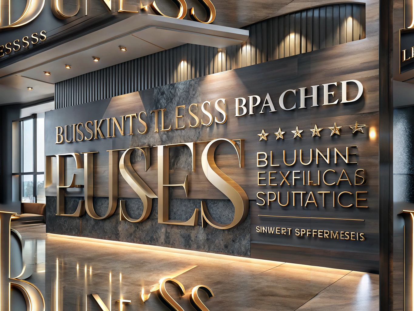
The Power of Typography in Branding
Typography is more than just letters on a sign; it’s a visual representation of your brand’s essence. For jet clubs, where elegance and clarity are non-negotiable, the font you choose speaks volumes about your business. The right signage font styles not only enhance readability but also attract attention and convey a sense of professionalism and luxury.
Font Styles That Speak to Sophistication
When it comes to business signage, certain font styles consistently rise to the occasion, offering both aesthetic appeal and functionality. Here are some top contenders:
- Sans Serif Fonts: With their clean lines and modern appeal, sans serif fonts like Helvetica and Arial are favorites for business signs. Their excellent readability from a distance makes them ideal for outdoor signage, ensuring your message is clear and impactful.
- Serif Fonts: For a touch of tradition and elegance, serif fonts such as Times New Roman and Georgia are perfect. They resonate with jet clubs aiming to evoke a sense of heritage and sophistication, aligning perfectly with a clientele that values exclusivity.
- Script Fonts: While not universally applicable, script fonts can add a personal and luxurious touch when used judiciously. Ideal for logos or special event signage, they bring a sense of bespoke elegance to your brand.
Key Considerations for Font Selection
Choosing the right font goes beyond personal preference. Here are essential factors to guide your decision:
- Readability: Your font should be easily legible from various distances. Avoid overly intricate designs that might hinder quick comprehension.
- Brand Alignment: The font must reflect your brand’s identity and values. For jet clubs, this often means selecting fonts that exude luxury and exclusivity.
- Contrast and Color: Ensure the font color contrasts well with the background to enhance visibility, taking into account the lighting conditions where the sign will be displayed.
Expert Tips for Effective Signage
To ensure your signage leaves a lasting impression, consider these expert tips:
- Limit Font Variety: Stick to one or two font styles to maintain a cohesive and professional look. Too many fonts can create visual clutter and detract from your message.
- Size Matters: Choose a font size appropriate for the viewing distance. Larger fonts are essential for signs meant to be read from afar.
- Test Before Finalizing: Create mock-ups of your signage to see how the font performs in real-world conditions. This step is crucial for making informed business sign font recommendations.
A Final Word on Font Selection
Selecting the perfect font for your business signage is a pivotal decision that shapes your brand’s perception. By prioritizing readability, brand alignment, and aesthetic appeal, you can choose fonts that resonate with your audience and elevate your jet club’s image. In a world where your clientele expects nothing but the best, investing time in selecting the right signage font styles is a step towards ensuring your business stands out.
Embrace these insights to craft impactful and memorable business signs that reflect the prestige and elegance of your jet club, leaving a lasting impression on all who encounter them.
For more insights on enhancing your business signage, visit our Signage Services page.