
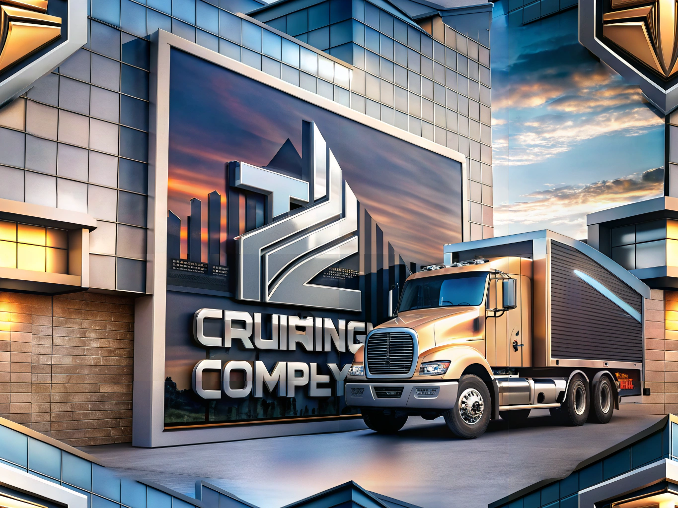
Designing Effective Business Signs for Trucking Companies
In the bustling world of transportation, where every mile counts, the art of designing business signs for trucking companies is more than just a creative endeavor—it’s a strategic move. These signs are not just markers; they are the face of your brand, a beacon for potential clients, and a tool for engagement. Yet, many fall into the trap of common design missteps that can derail their efforts. Let’s journey through five key mistakes to steer clear of, ensuring your trucking company’s signs are as effective as they are eye-catching.
The Beauty of Simplicity: Avoiding Overcomplicated Designs
In the realm of business sign design, less is often more. The allure of intricate graphics and detailed text can be strong, but clarity should always take the wheel. For trucking companies, where signs are often glimpsed at high speeds or from afar, a clean, straightforward design is paramount. Think of your sign as a quick conversation with a passerby—keep it concise, bold, and legible to ensure your message hits home instantly.
Brand Harmony: The Importance of Consistency
Imagine your brand as a symphony, with each element playing in harmony. A common pitfall is designing signs that sing a different tune from your overall branding strategy. Your business signage should echo your brand’s colors, logo, and typography, creating a seamless identity that resonates with professionalism and trust. This consistency not only boosts brand recognition but also assures clients of your reliability.
Color: The Silent Communicator
Colors speak volumes, often without a single word. In signage design, the wrong color choices can mute your message. Avoid the clash of colors that confuse rather than clarify. For trucking companies, where visibility is key, opt for high-contrast combinations that stand out in any light. Test your palette in various environments to ensure your sign remains vibrant and readable, no matter the backdrop.
Size and Placement: The Art of Visibility
A sign’s impact is often determined by its size and where it stands. Designing signs that are too small or poorly placed is a common oversight. For trucking companies, your signs should be large enough to catch the eye from a distance and strategically positioned in high-traffic areas. Consider the angles and potential obstructions—your sign should be a guiding star, not a hidden gem.
The Power of Invitation: Crafting a Compelling Call to Action
While the primary role of a sign is to inform, it should also invite action. A clear call to action (CTA) transforms a passive viewer into an active participant. Whether it’s directing them to your website, encouraging a call for a quote, or inviting them to follow your social media, a well-placed CTA can drive engagement and conversions, turning interest into interaction.
In the competitive landscape of the transportation industry, avoiding these common signage design pitfalls can set your trucking company apart. By embracing simplicity, ensuring brand consistency, choosing the right colors, optimizing size and placement, and crafting a compelling call to action, your business signs can become powerful tools of communication. Let these insights guide you in creating signage that not only captures attention but also conveys your message with clarity and impact.